Branding
A brand identity is so much more than a logo. Colours, typography, supporting icons and illustrations can all factor into a brand experience. Since all of that is hard to showcase on one page, this page showcases a few of the logos I’ve created.
Clients
ByWard Market District Authority, Little Jo Berry’s, Girls+ Rock Ottawa, Marchdale Massage, Cindy’s Walk & Sit, Women’s and Sexuality Studies Student Association, Baked From Scratch

The ByWard Market is Ottawa’s number one tourist attraction and I was lucky enough to get to design the logo for the Byward Market District Authority. We took inspiration from the Byward Market’s iconic building, Heritage Hall and developed a logo that speaks to the history of the market while maintaining a modern, but approachable, style.

This logo was created as a more functional version than the beautiful hand-painted logo the shop originally opened with and still uses on some marketing materials. It’s pink, it’s fun, and it incorporates a bit of the retro aesthetic that the shop embodies.
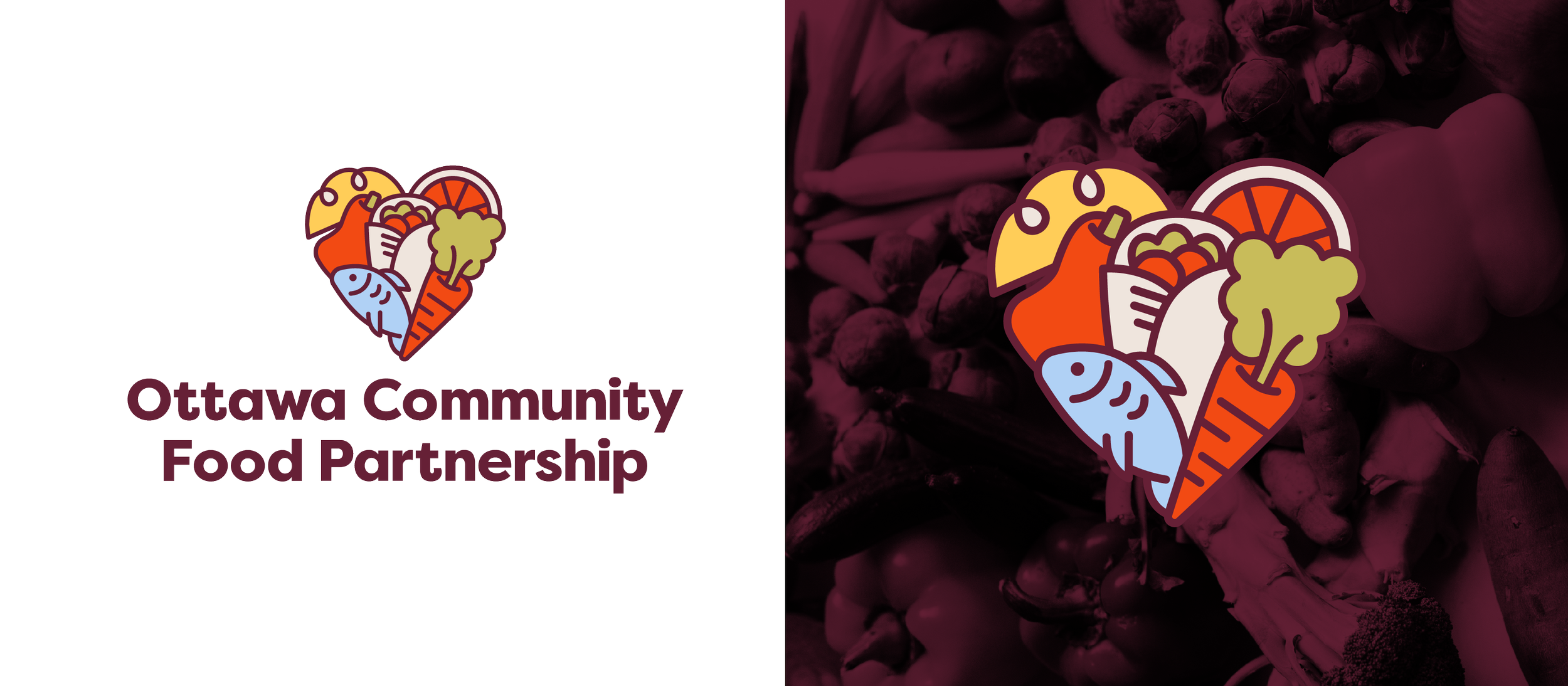
The Ottawa Community Food Partnership was created in 2016 to support the shift away from a traditional food charity model by moving towards meaningful community engagement and food security. Developing this logo, I wanted to speak to fresh and healthy food resources enveloped in a heart to show how important community food security is.

Cookies by Chistine is an amazing Ottawa baker that brings art to life on her cookies. The monarch butterfly was a symbol that she wanted included in her logo so we developed a butterfly cookie that feels dynamic and handmade. This logo is sweet and looks as delicious as the cookies.

HealxFoods is a health food company that specializes in taking your favourite comfort food and giving it a clean, plant-based makeover. They wanted a brand that’s warm, inviting and science-focused. Including the DNA strand as the X is a nod to their scientific background. This logo is friendly, fun and professional. Yum!
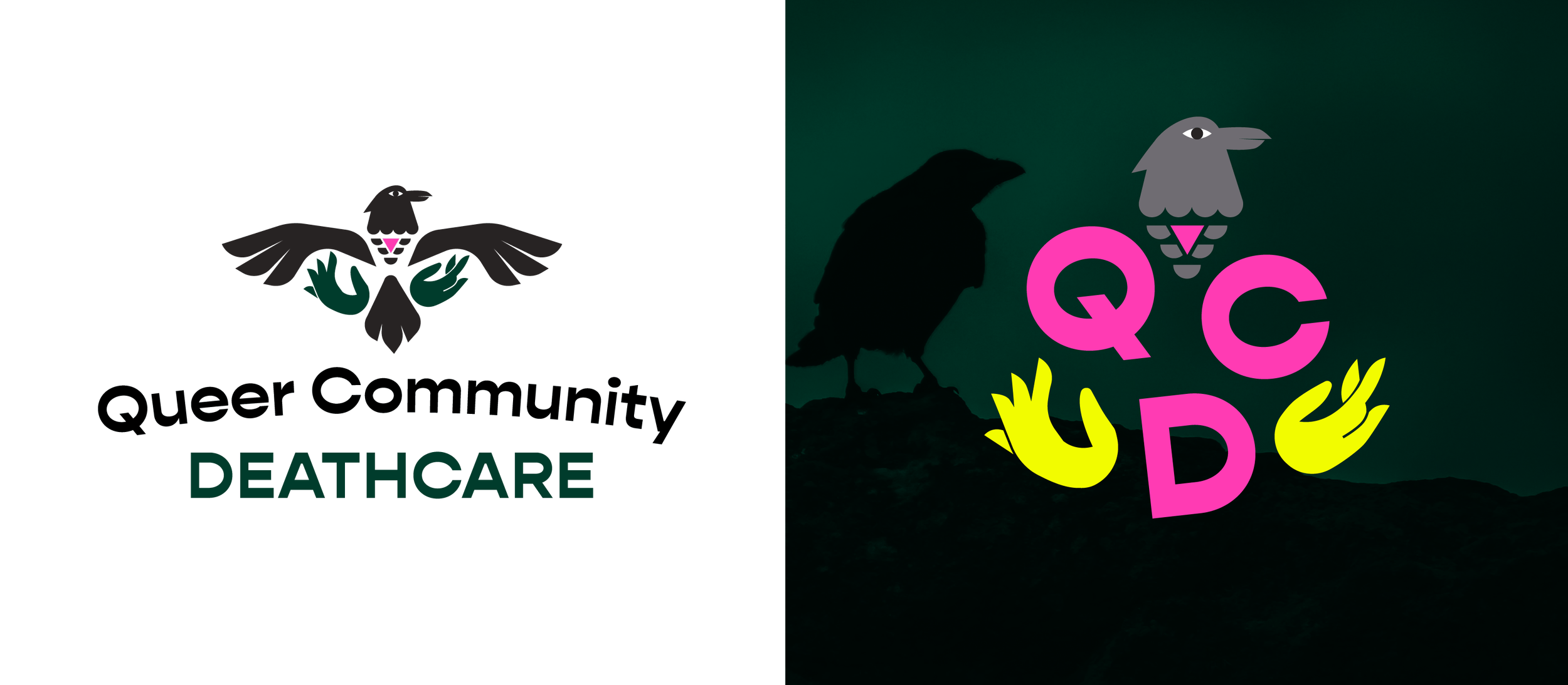
Queer Community Deathcare is a space of support for all members of the 2SLGBTQIA+ community in matters regarding end of life, death, dying, and grief. The logo we developed includes iconography of death, as well as transition, letting go and the queer community. Bold neon colours feel grounded in phthalo green.

Baked From Scratch is a local bakery in North Gower specializing in beautifully decorated cookies, stroopwaffels, tarts and many other tasty treats. Their cookies are so colourful, they wanted a minimal, black and white logo so their packaging wouldn’t compete with their beautiful products.

Girls+ Rock Ottawa was a volunteer-run community organization that provides music-based programming to foster empowerment, inclusivity and community to girls, women, femmes, trans, non-binary, two-spirit, and gender non-conforming folk (GWFTNB2SGNC+). I created their logo and website in 2017 and was inspired by the idea of the “big guitars” helping out the “little guitars” in the program.

Kidical Mass Ottawa is part of a growing international movement that calls for safe streets for kids, which are, in turn, safe streets for everyone. We came up with a logo that was fun and playful, built from hand-lettered text and an icon that speaks to bike safety and is child-friendly.
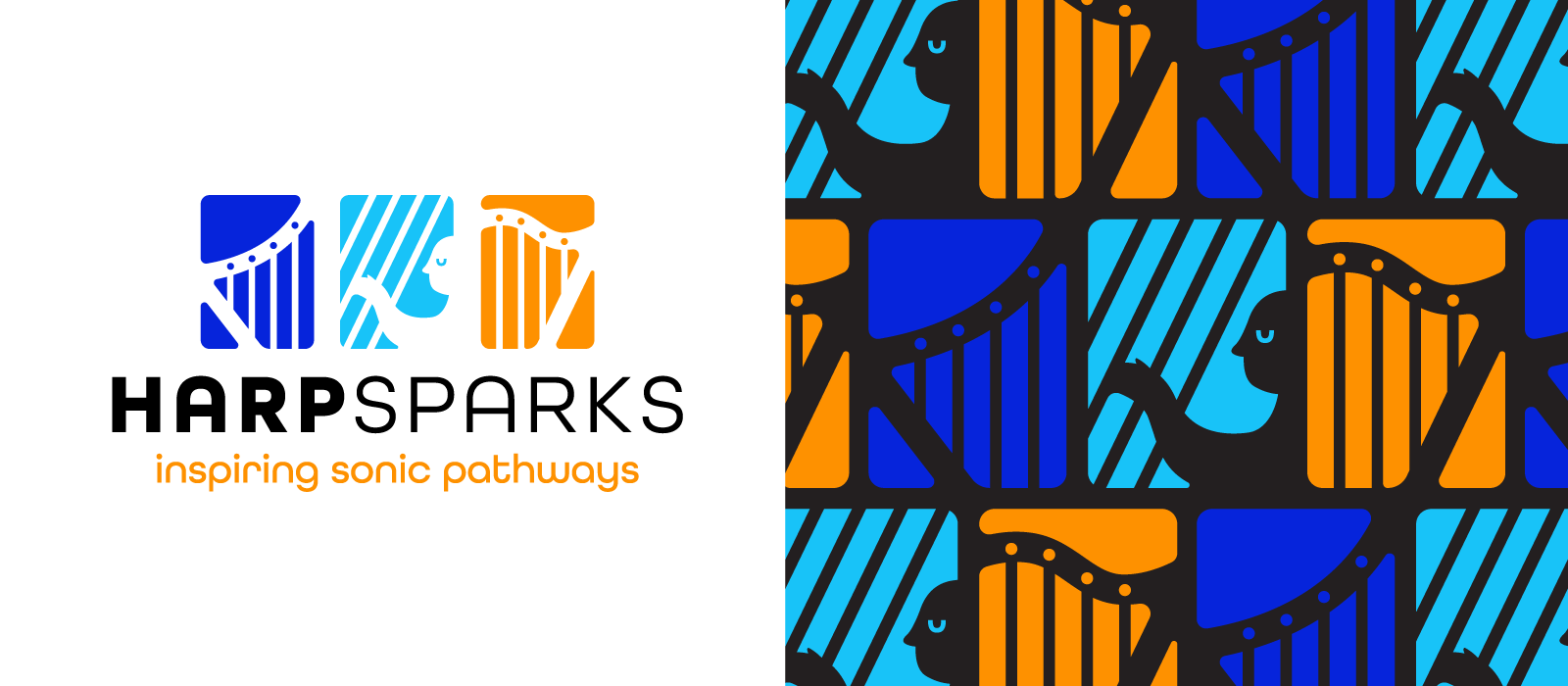
HarpSparks is a new music festival in Ottawa celebrating harp music. They wanted something dynamic, visually eye-catching and fresh. We wanted to celebrate the form of the harp without feeling too traditional.

Plant Deco was a family-run plant store that wanted to draw on the feelings of the art deco architecture and colouring of Miami. We decided on using a mix of fonts inspired by that look and feel and a tropical, but modern, colour theme with some simplified plant elements.

Bangin’ Balloons is an Ottawa balloons stylist who creates the most amazing balloon installations, garlands and bouquets. She wanted a brand that felt vintage, but still fresh and vibrant. The van was a statement branded piece that was a functional delivery van for their product but also acted as a moving advertisement around Ottawa.
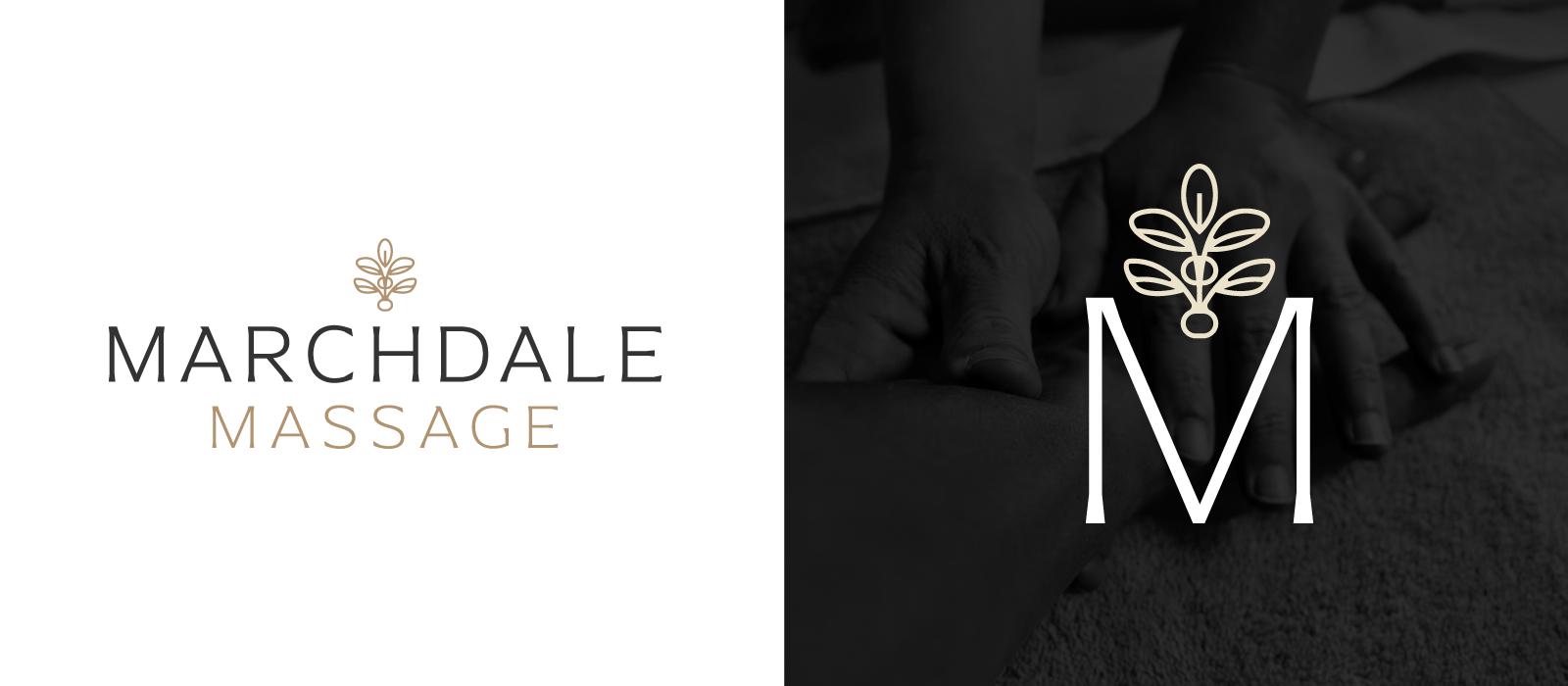
Marchdale Massage is a massage therapy business in Kanata. The client wanted to use a dark, calming colour pallette rooted in charcoal, black and hints of gold and cream to match the interior of their space. The icon is meant to feel botanical with a spinal influence.

I created this logo for a local dog-walking company in Centretown. We wanted to create a design that felt warm and inviting for all dog owners. Since the brand will mostly be used on Instagram, I created some fun Instagram story templates and backgrounds for posts with a pattern of unique doggy illustrations.

ArtsPark is a vibrant neighbourhood festival that celebrates the wonderful arts community in Wellington West. This wordmark was created to feel fun and include a nod to the pillars of music and visual arts.
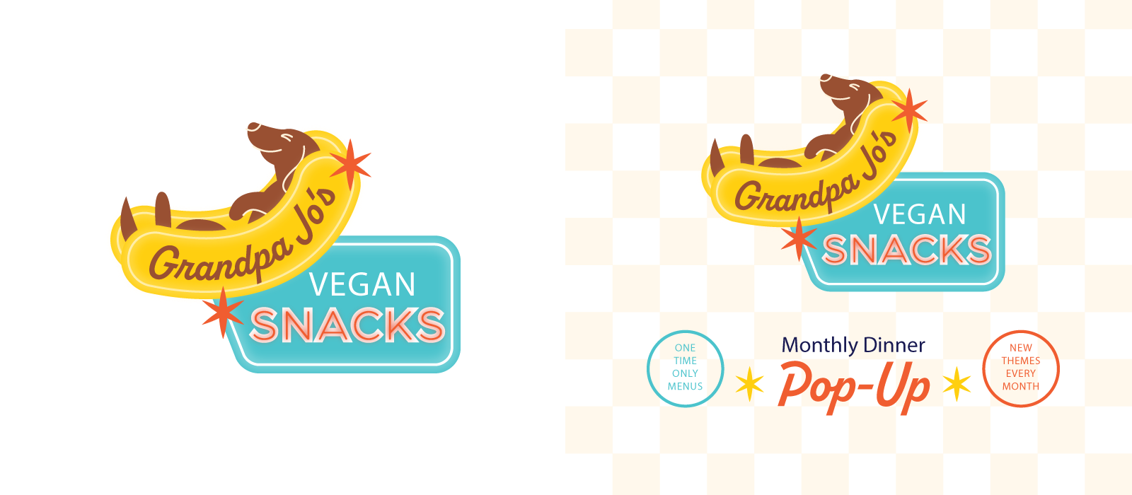
This logo was created for a popular diner-themed pop-up at Little Jo Berry’s. The client wanted a retro feeling logo that evokes the idea of the large neon diner signs from the 1950s. And who doesn’t love a weiner dog ;)
I created the “Bangin’ Balloons,” “ArtsPark” and “Plant Deco” logos while working at Character Creative.